I
have used the Photoshop programme for this e-art. Airbrushtool
It's a symbol like a little airbrush. Paintbrush This
symbol is a small brush with a partial handle. Smudgetool This
symbols is a hand with one finger extended.
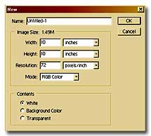
First open the program, choose "file" and then
"new" option. Once the blank canvas appears click on "image" and
choose "image size." A new window will appear and in most cases,
it will be in "inches" or pixels.
If it is inches then change that to "pixels". And enter the values
of 165 for the height and 169 for the width. Click OK. Once the
blank canvas appears go to "view" and select "fit on screen". This
will enlarge the canvas to fit onto the screen.
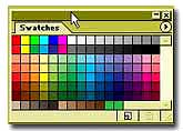
On the bottom of the row of icons are two boxes filled with color.
When you click swatches, a large
box filled with color will appear in which a round circle will be
included.
The round circle determines what color
you will get when you click OK. To the right of this box there is
a sliding scroll bar where you may select the areas of color you
may wish to acquire, i.e. Blue, red, yellow etc.
Click the primary
box and choose blue in the scroll bar to the right, then choose
a very light blue color which will use at the horizon. I've found
that putting the color on with the airbrush tool works best and
since I want reality in my sky I apply the color in short strokes
as seen in the example.
Click on the
"smudge tool" and begin at the horizon! Work in little ROUND circles
and, just as you would with paint, I am careful not to "pull" any
of the dark down into the light color! Once I have arrived at the
top of the canvas I should have a series of little circles. Work
as long as you need to in order to "mix you color thoroughly.
The
Last thing I do is to use the smudge tool across the sky to settle
out the swirl marks being careful not to wipe out all of the "action"
in the sky. Just that easy we have the stating of a nice little
sky!
From tool menu of the program you can select the size of the brushes
and smudge tool, etc. Click the "brushes" tab and select a large
size for this operation (this also increases the size of your smudge
tool).
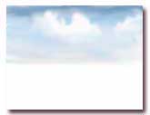
Now
we have a perfectly acceptable sky as it looks but you may add a
cloud or two thereby into your work. Click the primary color box
and choose a white. Use the airbrush tool and spray some white where
you wish to put a cloud.
Choose your cloud placement carefully. Don't just throw in a cloud.
Clouds are always more dramatic when they are placed next to the
darker portion of your sky and remember, if you put a cloud near
the horizon, it will need to be smaller in order to maintain the
sense of distance. Even clouds should have perspective!
Now take your smudge tool and work the cloud out in little round
circles. Push the white around until you have the tops of the clouds
looking proper then "get off the top!!" Move to the bottom of each
cloud and again, working in tiny circles, "blend" out the bottoms
thoroughly.
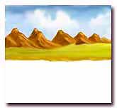
I select brown color
for the undercolor of mountains, you can choose a purple or something
else. Be inventive. Also, I have chosen to have my mountains run
"away" from me so they are smaller as they go toward the horizon.
Now, choose your own style or paint as you like. Don't be overly
concerned with the shape of your mountains at this stage. There
will be plenty of time to make corrections as we work out the highlights,
etc.
Put your
paintbrush tool and "paint" in the mountains as I have done here.
It will take a while to become accustomed to painting with your
mouse. We are all used to a brush and the adjustment can be a bit
troubling. Then change 'Brush' to 50% in size and at 50% transparency.
I have choose a light brown from primary color box (or lighter of
the color you chose for your mountains) for the light side of you
mountains. This is just the beginning step of our efforts we will
do on these mountains. Choose the paintbrush tool and choose the
small brush size. Lay in some light color on the sides of your mountains
where the light source will hit them.
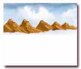
Leave some dark spots on light side. Make flat spots and undulations
on you mountains. Don't have all of the bottoms of the mountains
end at the same level. Take your time! After you have laid in the
light color take you smudge tool and lightly smudge the colors together.
Notice that I have left a little "inroad" in the foot of one of
the mountains. Later this will be a way to "walk into the mountains."
Plan ahead!
Choose a brown that is just a bit darker than my original undercolor
and I have applied that to PARTS of the dark sides of the mountains.
Don't overdo...just here and there. Have fun, play around with your
mountains but in the spirit of moving on, let's continue. Now I
am making an effort to keep this exercise quite simple we are not
going to concern ourselves with color composition, etc.
Now select a green suitable for some grass. I have made the grass
lighter as it goes toward the horizon. I sprayed it in with the
airbrush tool then smoothed it out with the smudge tool. Pay particular
attention to where the different colors meet and I smudge that area
until the transition is complete.
Put the grassy
area down and have added a shoreline with some of the same color
that I used to make the mountains. We are not concerning ourselves
with color correctness in this first exercise, it is good to repeat
a color for balance. Added a highlight or two. Again after each
step I use the smudge tool to "smooth" the area.
Now I have laid in grassy area down just as I did in the sky but
this time I apply the strokes in horizontal streaks instead of the
little circles. Again you will note that the water is lighter in
color next to the bank and darker as it comes toward you. This keeps
the feeling of distance in our work. Keep it very simple in this
little exercise. Again, after I applied the color I used the smudge
tool to "level" out the water. I do all of this work ACROSS the
canvas so as to lay the water down flat.
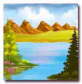
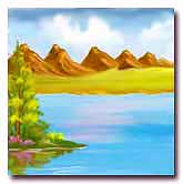
I rendered the tree with the airbrush tool and the smudge tool.
Use your artistic inclinations and work out the problems with the
tree. The flowers and bushes are quite simple. Dark first then add
light with a small airbrush. The reflections are really very simple.
Take the smudge tool, click a rather large brush size and grab the
bottom of the green and pull Straight Down. If you like the reflections
to "wave" in the water pass the smudge tool ACROSS the image! As
you can see I added a white ripple at the shore line with a small
paintbrush tool.
At last add a large pine tree to act as an eyeblocker. I've kept
the tree mostly in silhouette in order to minimize it's importance
to the painting and aid inviting the viewer "into" the painting.
I used the paintbrush tool for the tree and the smudge tool for
the reflections in the same manner as I did before.
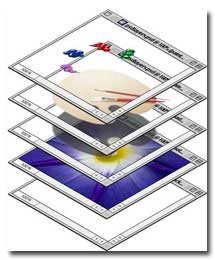
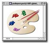
Working With Layers
In Photoshop
One of Photoshop's most powerful features is the use of layers.
Each layer in a Photoshop document is a separate image which can
be edited apart from any other layer. A layer can be envisioned
as an image on a sheet of clear material. Together, all the layers
form a stack of images:
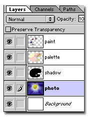
1. Layers are managed with the Layers palette (below
left). The Layers palette displays a small thumbnail view of each
layer to help identify it. The appearance of a Photoshop document
is a view of the layer stack from the top down (below right).
2. You can turn layer visibility on and off and completely change
the appearance of an image without permanently affecting a single
pixel. The eye icon to the left of each layer controls its visibility.
A layer is made visible or hidden by clicking its eye icon (below
left). The result is the same Photoshop document shown previously
with the exception that one of its layers has been hidden revealing
the white background underneath.
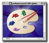
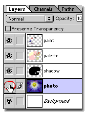
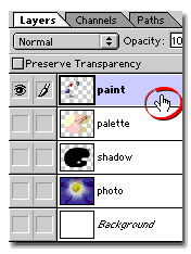
3. Opt/Alt-clicking a layer's eye icon will make it
visible and will hide all others (below left). In the example below,
the layer named "paint" becomes the only visible layer
(below right). Note that the layer named "photo" is still
highlighted. The highlighted layer in the Layers palette indicates
that it is the active (or selected) layer. This means
that all editing in the document window will be applied to the active
layer.
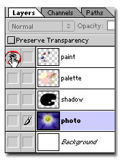
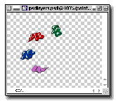
4. Click a layer to activate it (circled below left).
Now all editing in the document window will be applied to the "paint"
layer.
Note that there is no change in the appearance
of the document window (below right). Look to the Layers palette
to see which layer is active, not to the document window.
Walls
and Ceilings Accent your decor with the handcrafted look
of stencil painting.
Materials
Clear acetate (.0075-gauge) or oiled
stencil board
Masking tape
Paper towels
Acrylic paint
Rags
Tools
Utility knife or craft knife
Fine-tip permanent marker
Short-bristled stencil brush
Straightedge
Tape measure
Stepladder
Overview
You can buy stencils ready-made
at some paint stores and decorating shops, but cutting your
own will give you a more unique, personalized result. Though
you can apply several colors using a series of stencils, a single
color is far easier to do successfully.
Two materials are popular for making stencils: clear .0075-gauge
acetate and oiled stencil board. Because acetate is transparent,
itĺs easier to use for aligning designs and the best choice
if youĺre going to try layering more than one color. Stencil
board is more rugged and, because it is rigid, a little easier
to hold flat against a wall. Both can be purchased at art supply
stores.
Choose a paint that will dry quickly. Artistsĺ acrylics thinned
with water or artistĺs acrylic medium are a good choice, or
you can use conventional acrylic latex paint.
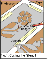
Cut out the stencil.
The easiest way to transfer an existing decorative design
to stencil material is to photocopy the design, then use the
copier to enlarge or reduce it. Be sure to plan your design
so that the spacing of patterns falls evenly across the wall
or ceiling and ends appropriately at the corners.
To cut the design out of stencil board, spray the back of
the final photocopy with removable adhesive and press it onto
the stencil board. Smooth it out and tape down the edges.
Working on a flat cutting surface such as a piece of cardboard,
use your utility knife or craft knife to cut through both
layers, then peel off the photocopy. If youĺre using acetate,
just tape the acetate to the surface of your photocopy pattern
to cut it out.
Note: When you cut the stencil, you must leave "bridges"Śuncut
areas of stencil that hold the parts together (see Figure
1).
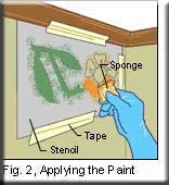
Mount and paint
the stencil.
Mark the wall lightly in pencil to identify the stencilĺs
positions and to keep the patternĺs alignment straight. Tape
the stencil to the surface at its first position, using masking
tape or, preferably, drafting tape that won't leave marks.
The most difficult part of stencilling is preventing paint
from oozing under the stencilĺs edges. Itĺs a good idea to
work with a nearly dry brush or small synthetic sponge. Dip
the tool in a small amount of paint, then remove excess paint
by twisting the brush bristles or daubing the sponge against
a paper towel.
Hold the tool perpendicular to the surface, applying the paint
with an up-and-down motion from the cutoutsĺ edges toward
the center (see Figure 2). Donĺt drag the paint across the
surface of the stencil or you may force paint under the stencilĺs
edges.
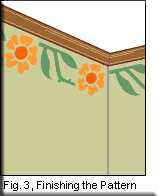
Finish the pattern.
Carefully remove the stencil and touch up any smudges at the
edgesŚand any bridged areas that you want to fill inŚwith
a fine brush (see Figure 3). Allow the paint to dry.


 box filled with color will appear in which a round circle will be
included.
box filled with color will appear in which a round circle will be
included. Click the primary
box and choose blue in the scroll bar to the right, then choose
a very light blue color which will use at the horizon. I've found
that putting the color on with the airbrush tool works best and
since I want reality in my sky I apply the color in short strokes
as seen in the example.
Click the primary
box and choose blue in the scroll bar to the right, then choose
a very light blue color which will use at the horizon. I've found
that putting the color on with the airbrush tool works best and
since I want reality in my sky I apply the color in short strokes
as seen in the example.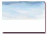 Click on the
"smudge tool" and begin at the horizon! Work in little ROUND circles
and, just as you would with paint, I am careful not to "pull" any
of the dark down into the light color! Once I have arrived at the
top of the canvas I should have a series of little circles. Work
as long as you need to in order to "mix you color thoroughly.
Click on the
"smudge tool" and begin at the horizon! Work in little ROUND circles
and, just as you would with paint, I am careful not to "pull" any
of the dark down into the light color! Once I have arrived at the
top of the canvas I should have a series of little circles. Work
as long as you need to in order to "mix you color thoroughly.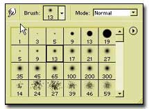 The
Last thing I do is to use the smudge tool across the sky to settle
out the swirl marks being careful not to wipe out all of the "action"
in the sky. Just that easy we have the stating of a nice little
sky!
The
Last thing I do is to use the smudge tool across the sky to settle
out the swirl marks being careful not to wipe out all of the "action"
in the sky. Just that easy we have the stating of a nice little
sky! 
 Now
we have a perfectly acceptable sky as it looks but you may add a
cloud or two thereby into your work. Click the primary color box
and choose a white. Use the airbrush tool and spray some white where
you wish to put a cloud.
Now
we have a perfectly acceptable sky as it looks but you may add a
cloud or two thereby into your work. Click the primary color box
and choose a white. Use the airbrush tool and spray some white where
you wish to put a cloud. 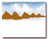 I select brown color
for the undercolor of mountains, you can choose a purple or something
else. Be inventive. Also, I have chosen to have my mountains run
"away" from me so they are smaller as they go toward the horizon.
Now, choose your own style or paint as you like. Don't be overly
concerned with the shape of your mountains at this stage. There
will be plenty of time to make corrections as we work out the highlights,
etc.
I select brown color
for the undercolor of mountains, you can choose a purple or something
else. Be inventive. Also, I have chosen to have my mountains run
"away" from me so they are smaller as they go toward the horizon.
Now, choose your own style or paint as you like. Don't be overly
concerned with the shape of your mountains at this stage. There
will be plenty of time to make corrections as we work out the highlights,
etc. 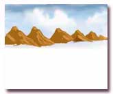
 Choose a brown that is just a bit darker than my original undercolor
and I have applied that to PARTS of the dark sides of the mountains.
Don't overdo...just here and there. Have fun, play around with your
mountains but in the spirit of moving on, let's continue. Now I
am making an effort to keep this exercise quite simple we are not
going to concern ourselves with color composition, etc.
Choose a brown that is just a bit darker than my original undercolor
and I have applied that to PARTS of the dark sides of the mountains.
Don't overdo...just here and there. Have fun, play around with your
mountains but in the spirit of moving on, let's continue. Now I
am making an effort to keep this exercise quite simple we are not
going to concern ourselves with color composition, etc. 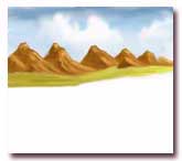
 Put the grassy
area down and have added a shoreline with some of the same color
that I used to make the mountains. We are not concerning ourselves
with color correctness in this first exercise, it is good to repeat
a color for balance. Added a highlight or two. Again after each
step I use the smudge tool to "smooth" the area.
Put the grassy
area down and have added a shoreline with some of the same color
that I used to make the mountains. We are not concerning ourselves
with color correctness in this first exercise, it is good to repeat
a color for balance. Added a highlight or two. Again after each
step I use the smudge tool to "smooth" the area. 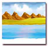
 I rendered the tree with the airbrush tool and the smudge tool.
Use your artistic inclinations and work out the problems with the
tree. The flowers and bushes are quite simple. Dark first then add
light with a small airbrush. The reflections are really very simple.
I rendered the tree with the airbrush tool and the smudge tool.
Use your artistic inclinations and work out the problems with the
tree. The flowers and bushes are quite simple. Dark first then add
light with a small airbrush. The reflections are really very simple.